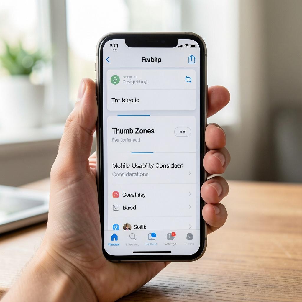
Designing for Thumb Zones: Mobile Usability Considerations
When it comes to designing mobile interfaces, one of the most crucial considerations is thumb zone usability. The thumb zone refers to the area of the screen that is easily accessible to the user's thumb, typically the bottom third of the screen. This zone is critical because it's the area where users most frequently interact with their devices. In this article, we'll explore the importance of designing for thumb zones and provide practical tips for mobile usability.
Why Thumb Zones Matter
The reason thumb zones are so important is that they're the most convenient and efficient way for users to interact with their devices. When designing for mobile, it's essential to keep the most critical features and buttons within the thumb zone to ensure seamless navigation. Think about it: when you're scrolling through your phone, you're not using your index fingers to tap on buttons; you're using your thumbs. This is because your thumbs are naturally more agile and can easily access the bottom of the screen.
Designing for Thumb Zones: Best Practices
So, how do you design for thumb zones? Here are some best practices to keep in mind:
- Place primary buttons at the bottom: Position your primary buttons, such as "Save" or "Submit," at the bottom of the screen to make them easily accessible. This ensures that users can complete tasks quickly and efficiently.
- Keep important information above the fold: When designing for mobile, it's essential to keep important information above the fold, meaning it should be visible without scrolling. This ensures that users can quickly find the information they need without having to navigate through multiple screens.
- Use a consistent design pattern: Consistency is key when designing for mobile. Use a consistent design pattern throughout your app or website to make it easy for users to navigate. This includes using the same button styles, font sizes, and colors.
- Avoid small buttons: Small buttons can be difficult to tap, especially for users with larger fingers or those who are scrolling quickly. Use larger buttons that are easy to tap and avoid cluttering the screen with too many buttons.
- Consider thumb-friendly scrolling: When designing for mobile, it's essential to consider thumb-friendly scrolling. This means avoiding scrolling mechanisms that require users to lift their thumbs off the screen, such as scrolling arrows or tabs.
Common Mistakes to Avoid
While designing for thumb zones is crucial, there are some common mistakes to avoid:
- Cluttering the screen: Avoid cluttering the screen with too many buttons or elements. This can make it difficult for users to find what they're looking for and can lead to frustration.
- Ignoring accessibility: Don't ignore accessibility when designing for mobile. Make sure that your design is accessible to users with disabilities by using clear and consistent design patterns.
- Not testing for thumb zones: Don't forget to test your design for thumb zones. Test your app or website on a variety of devices to ensure that it's thumb-friendly and easy to navigate.
Conclusion
Designing for thumb zones is a critical aspect of mobile usability. By following best practices and avoiding common mistakes, you can create a mobile experience that is intuitive, efficient, and enjoyable. Remember to keep primary buttons at the bottom, keep important information above the fold, use a consistent design pattern, avoid small buttons, and consider thumb-friendly scrolling. By doing so, you'll be well on your way to creating a thumb-friendly mobile experience that users will love.