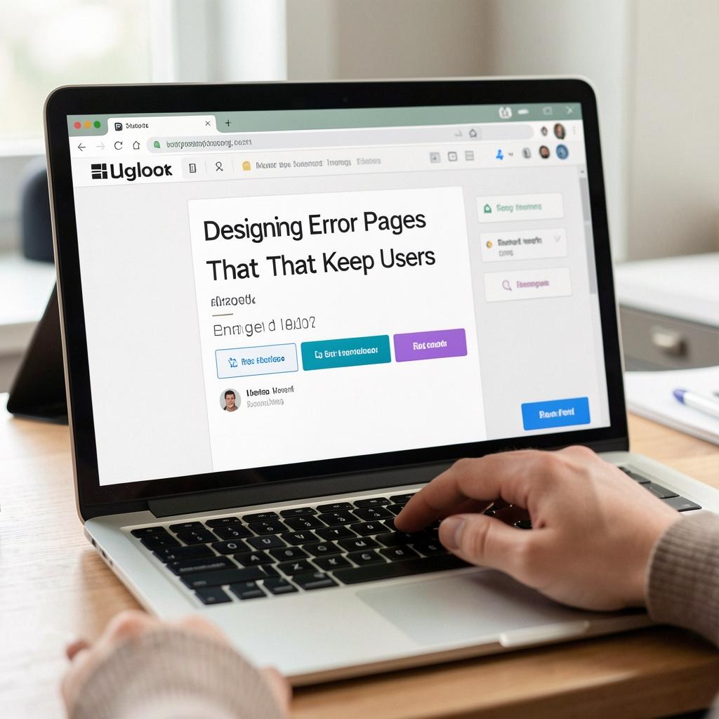
Designing Error Pages That Keep Users Engaged
As designers, we've all been there – staring at a blank page, trying to come up with a creative solution to a seemingly mundane problem. Error pages are one of those tasks that can be tedious, yet crucial for maintaining a positive user experience. A well-designed error page can make all the difference in keeping users engaged, even in the face of failure. In this article, we'll explore the importance of error page design and provide some practical tips to help you create effective ones.
The Importance of Error Pages
Error pages are often the forgotten stepchild of website design. They're usually an afterthought, a necessary evil that we settle for because we have to. But the truth is, error pages have a significant impact on user experience. A poorly designed error page can lead to frustration, confusion, and even abandonment. On the other hand, a well-designed error page can turn a negative experience into a positive one.
So, what makes a good error page? For starters, it should be clear and concise. Users shouldn't have to decipher what went wrong or what to do next. The message should be straightforward, with minimal jargon and no confusing technical details. A good error page should also provide a clear call-to-action (CTA) – in other words, what the user should do next.
Practical Tips for Designing Error Pages
- Keep it Simple: Avoid clutter and keep the design simple and easy to read. A clean and minimalistic design will make it easier for users to focus on the message.
- Be Transparent: Users want to know what happened and why they got an error. Be transparent and provide a clear explanation of the problem.
- Provide a CTA: Don't leave users wondering what to do next. Provide a clear CTA that tells them what to do to resolve the issue.
- Add a Personal Touch: Error pages are a great opportunity to add a personal touch to your website. Use humor, or add a human touch to make the experience more engaging.
- Make it Scannable: Users are busy, and they won't take the time to read every word on the page. Make the text scannable by using headings, bullet points, and short paragraphs.
- Use Visuals: Error pages are a great opportunity to add some visual interest to your website. Use images, icons, or even animations to break up the text and make the page more engaging.
- Test and Iterate: Finally, test your error pages and iterate based on user feedback. Use analytics to track how users interact with your error pages and make changes to improve the experience.
Conclusion
Error pages are an often-overlooked aspect of website design, but they're crucial for maintaining a positive user experience. By following these practical tips, you can create error pages that keep users engaged, even in the face of failure. Remember to keep it simple, be transparent, provide a CTA, add a personal touch, make it scannable, use visuals, and test and iterate. With these tips, you can turn a negative experience into a positive one, and keep your users coming back for more.